Starting out in 1982 as a small, Adelaide-based surveying company, Fyfe has evolved to become the leading Australian owned integrated professional project services firm in the defence, energy, resources, property and infrastructure sectors.
As our business evolved, so too has the Fyfe brand.
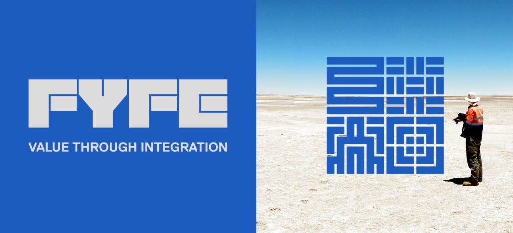
We’re thrilled to present our ‘brand refresh’, which has seen us drill down into who we are as an organisation.
“The brand refresh represents a new generation of the company,” said Fyfe’s Executive Chairman, Mark Dayman.
“Our former brand had run its course and done its job, and it was time to think about who we are as an organisation.”
With the company in its “strongest position ever”, the brand refresh has helped Fyfe communicate its multi-disciplinary service offering, unify its market presence, and modernise the corporate colours.
“The terms I use to describe Fyfe are strong and successful,” Mark said.
“We’ve been through tough times, we’ve come through that, and now we’re in our strongest position ever.
Being in a good position, Mark believed there was no need to rebrand Fyfe entirely.
“In essence, we were really happy with what we are as a company – we wanted an evolution, we didn’t think we needed to fully rebrand, as there was no reason for dramatic change.
“The new logo looks much stronger – we’ve evolved that strong look over time, and the value for integration and brand story is representative of where we are and where we’re heading.”
The brand story communicates Fyfe’s commitment to Australia and the sectors that underpin our economy, and delivering value through integration – by being smarter, faster and cost-efficient for our clients.
The brand refresh also positions Fyfe to embrace future opportunities, and weather the impacts of the changing landscape of business
“This investment in our brand demonstrates our strong belief in the future of the sectors in which we operate, and our place within them.
“It will allow us to continue to grow and diversify the business, particularly in the sectors and regions where we see significant growth – places like Melbourne, Perth and Sydney.”
Feedback from both within and outside the organisation has been positive.
“What this brand refresh has done has pulled the brand together in a strong theme,” said Mark.
“It really has delivered a fresh, modern image, and people are really happy with it.
“While the changes to the logo are minor, they’ve been noticed. Our clients’ and peers have all ‘got’ the evolution and our improvement of identity.
“Internally, our people are proud of the company – the feedback we’ve received is amazingly positive.
“It’s really helped people warm to the identity of the company.”